A fresh coat of paint can change a room faster than almost any other update, but choosing the right shade is where most people get stuck. If you’re wondering what interior house paint colours are trending, the short answer is this: homes are moving away from stark, cold tones and towards colours that feel warmer, softer and easier to live with.
That shift matters because trends only work when they suit the way a home is used. A colour might look great on a sample card or in a display home, but if it fights your flooring, darkens a hallway or shows every mark in a busy family space, it will not feel like a good decision for long. The best trending colours right now are popular for a reason – they bring character without making a room hard to furnish or maintain.
What interior house paint colours are trending right now
The biggest trend across interiors is warmth. That does not mean every room needs to be beige, but it does mean the harsh bright whites and icy greys that dominated for years are losing ground. In their place, homeowners are choosing tones with more depth and a more natural feel.
Warm whites are leading the way. These are not creamy yellows, and they are not clinical whites either. They sit in the middle, giving walls a clean finish while still feeling soft. They work especially well in living rooms, hallways and open-plan areas where natural light changes throughout the day.
Earthy neutrals are also trending strongly. Think soft greige, clay, sand, mushroom and taupe. These colours suit homes that want a calm, finished look without going too plain. They are easy to pair with timber, stone, black fittings and most furniture styles, which is one reason they have become such a reliable choice.
Muted greens continue to grow in popularity, particularly sage, olive-grey and dusty eucalyptus tones. Green works because it adds colour without feeling loud. In bedrooms, studies and living spaces, it can create a settled atmosphere that still feels current.
Blue is still around, but it has shifted. Strong coastal blues and cool blue-greys are less common than before. The trend now leans toward softer, dirtier blues with grey or green undertones. These shades can work beautifully in bathrooms, bedrooms and quieter sitting areas.
There is also a clear move towards deeper feature colours, but in a more considered way than in the past. Charcoal, deep green, warm navy and muddy terracotta are being used on cabinetry, powder rooms, studies and selected walls rather than across entire homes. When done properly, they add contrast and make lighter adjoining spaces feel more refined.
Why warm and earthy colours are replacing cooler tones
Part of the answer is visual fatigue. Many homes were painted in cool grey and bright white because they felt safe and modern. Over time, though, those schemes started to feel flat, especially once paired with hard finishes like polished tiles, stone benchtops and black hardware.
Warmer colours soften those surfaces. They make a room feel more settled and more lived in. That is important in family homes, investment properties and renovated houses alike, because people want spaces that present well but also feel comfortable on an ordinary Tuesday night.
There is also a practical side. Warm whites and natural neutrals tend to handle changing light better than sharp cool shades. In Melbourne homes, where weather and daylight can shift quickly, that flexibility matters. A cool grey that looks neat in full sun can feel dull or bluish in shadow. A warmer neutral usually holds up better across the day.
Trending colours by room
Not every trend belongs in every space. The better approach is to match the colour to the room’s job, the amount of light it gets and the level of wear it sees.
Living areas and open-plan spaces
Warm white, soft greige and light taupe are the strongest choices here. They keep the area bright while making it easier to tie together flooring, cabinetry and furniture. If the room is large, a slightly deeper neutral can stop it feeling too empty or echoey.
Bedrooms
Bedrooms are leaning into softness. Dusty green, warm beige, muted blue and off-white all work well because they create a quiet backdrop. Strong colours can still work, but they need to be used carefully. In most homes, a toned-down shade will age better and be easier to style.
Kitchens and dining areas
Kitchen walls are trending towards warm neutrals and soft whites that work with cabinetry and splashbacks rather than competing with them. If cabinets are already bold, the wall colour often needs to step back. In dining spaces, a little more depth can work well, especially if the room is used in the evening and benefits from a more intimate feel.
Bathrooms and laundries
These rooms still suit lighter colours, but not necessarily cold ones. Soft white, pale greige and subtle green-grey can make wet areas feel cleaner without looking stark. The right finish matters here just as much as the shade, because moisture resistance and washability are part of getting a lasting result.
What interior house paint colours are trending for older homes
Older homes can carry colour differently from newer builds. Period details, timber trims, ceiling height and natural light all affect how a paint colour reads on the wall.
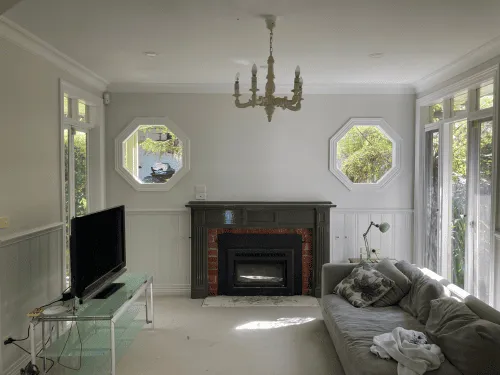
For these homes, trends work best when they respect the character already there. Warm whites, mushroom tones, soft sage and muted stone colours often suit older interiors because they add freshness without stripping away personality. If a home has decorative cornices, timber doors or heritage features, these shades can lift the space while still feeling appropriate.
By contrast, very cold white can make an older room feel disconnected from its original details. That does not mean it can never work, but it usually needs careful planning around trim, flooring and lighting.
The trade-off with trendy paint colours
Following a trend makes sense when the colour has broad appeal and fits the home. It becomes a problem when trend overrides function.
A dark feature wall might look impressive online, but in a narrow room it can make the space feel tighter. A fashionable warm beige might be perfect in one home and too muddy in another with low natural light. Even popular whites can turn pink, yellow or grey depending on the undertones in nearby finishes.
That is why sampling matters. Paint never lives in isolation. It sits next to floors, tiles, curtains, cabinetry and furniture, and all of those elements affect the final result. What looks current on a trend board needs to work in your actual space.
How to choose a trending colour without regretting it
Start with the fixed elements you are not changing. Flooring, benchtops, tiles and large furniture pieces will all narrow down the colours that make sense. This saves time and helps avoid expensive repainting.
Next, look at light. A north-facing room can handle more depth and warmth, while a darker room may need a lighter tone to stop it feeling closed in. Test samples on multiple walls and check them in morning, afternoon and evening light.
Think about maintenance too. Busy hallways, kids’ rooms and rental properties usually benefit from forgiving colours with a durable finish. Some very pale shades show marks quickly, while very dark colours can highlight scuffs, patching and surface imperfections.
Finally, decide whether you want the room to feel timeless or statement-driven. If you are repainting for long-term liveability or resale, softer trending colours tend to be the safer option. If you want a stronger look, use it where it adds value without taking over the whole house.
Trendy does not have to mean risky
The best paint trends are the ones that make a home look better now and still feel right years from now. At the moment, that means warmer whites, earthy neutrals, muted greens and softer, more grounded shades overall. They are popular because they work – not just in photos, but in real homes with real wear, changing light and everyday use.
If you are planning an interior repaint, focus less on chasing the newest shade and more on choosing colours that suit your rooms, your finishes and the way you live. A trend can point you in the right direction, but the right paint job is the one that still looks good after the brushes are packed away.