The best interior paint colour trends are moving away from cold, show-home neutrals and towards colours that make a property feel settled, comfortable and easy to live in. For Melbourne homeowners, that means warmer whites, softened earthy tones and deeper accents that suit changing light, period details and modern extensions alike. The right colour should look good on a sample card, but it also needs to work with your flooring, furnishings, natural light and the everyday traffic through the room.
A trend is useful when it gives you a starting point, not when it dictates every wall in the house. A well-planned interior paint job should still look considered years from now, whether you are preparing to sell, updating a rental property or making your family home feel more like your own.
Interior paint colour trends are getting warmer
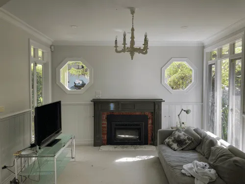
Cool grey dominated interiors for a long time. It can still work in the right setting, particularly in a bright contemporary apartment or commercial fit-out, but many spaces now benefit from a warmer base. Think soft off-whites with a hint of cream, muted stone, light mushroom and gentle beige rather than stark white or blue-grey.
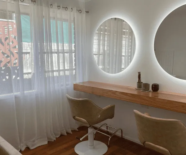
These colours are popular for a practical reason: they make rooms feel more welcoming without becoming overly yellow. They also sit comfortably alongside the timber floors, natural stone, brushed metal and textured fabrics that are common in current interiors.
Warm white is not a single colour. Some whites have a peach, yellow, grey or green undertone, and that undertone becomes obvious once the paint covers a full wall. A white that looks clean in a showroom can look dull beside a cool-grey tile, while another may appear too creamy under warm downlights. Testing a generous sample area is always worthwhile, especially in rooms with limited daylight.
Earthy neutrals bring more character to living areas
The strongest shift in interior colour is towards grounded, nature-led neutrals. Soft clay, dusty terracotta, putty, muted olive, tobacco and sand are being used to add depth without making a room feel heavy. These shades have enough personality to create an intentional finish, while remaining flexible enough for changing furniture and décor.
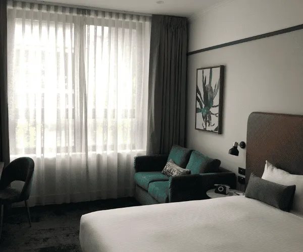
In living rooms and dining rooms, a warm taupe or light clay tone can create a relaxed backdrop for timber furniture and natural textiles. In a bedroom, a soft olive or muted blue-green can feel calm without the sharpness of a cooler grey. The key is restraint. A colour with a greyed or softened base tends to be more liveable than a highly saturated version of the same shade.
For property managers and landlords, these tones can also be useful when applied carefully. A durable, versatile neutral across main areas provides broad appeal, while a single feature wall in a bedroom, study or reception space can add character without narrowing the market too much.
Deep colours are being used with purpose
Dark paint is no longer limited to a dramatic dining room. Deep green, charcoal, ink blue and rich brown are increasingly used in studies, powder rooms, hallways, joinery and feature walls. They can make an ordinary area feel more finished, particularly where there are good timber details, warm lighting or architectural features worth highlighting.
However, dark colours are not automatic winners. In a narrow hallway with little light, a dark wall may feel enclosed unless the ceiling, trim and lighting are planned around it. In a large room with tall ceilings, it can add the visual weight the space needs. Finish matters as well. A low-sheen or matte wall finish usually gives deeper colours a more refined appearance, but it may show marks more readily in busy family zones.
A practical approach is to use a deep colour where it has a clear job to do: defining a work zone, framing a fireplace, adding depth behind shelving or making a compact powder room feel deliberate rather than overlooked.
Ceiling, trim and doors are part of the colour plan
One of the more useful interior paint colour trends is treating the whole room as a scheme instead of painting walls first and making the rest an afterthought. Traditional bright-white ceilings and trims remain a reliable choice, particularly where you want maximum light and a crisp result. But tonal schemes are becoming more common.
Painting the walls, skirting boards, architraves and doors in related shades can soften the hard lines of a room. It is particularly effective in older Melbourne homes with decorative trim, because it lets the shape and craftsmanship of the joinery stand out without making every edge contrast sharply. A slightly deeper colour on doors can also give an entry or hallway a stronger sense of arrival.
For a more contemporary look, some homeowners take the wall colour onto the ceiling in a pale version of the same tone. This can work beautifully in a small bedroom or snug room, but consider ceiling height and light levels before committing. A lighter ceiling generally helps an already-dark space feel more open.
Colour zoning works in open-plan spaces
Open-plan homes need colour that creates connection without making every area feel identical. Rather than using a different colour for every function, choose a main neutral and use one or two supporting tones to define separate spaces.
For example, the kitchen and living area may share a warm off-white, while the dining nook uses a muted earthy shade to make it feel distinct. A study corner can carry a deeper accent colour that helps visually separate work from home life. This approach offers structure without chopping up the space.
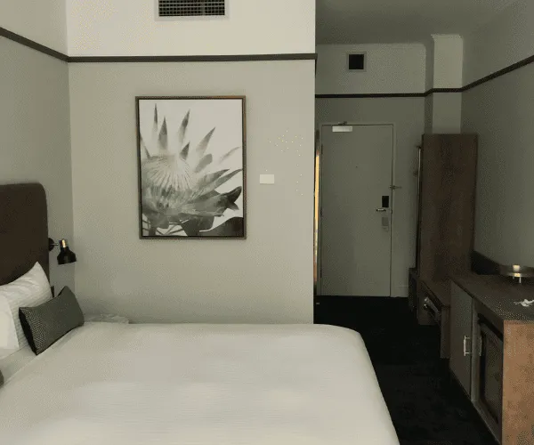
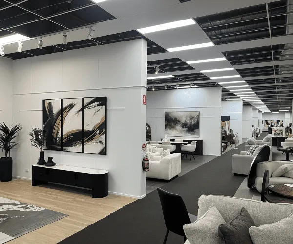
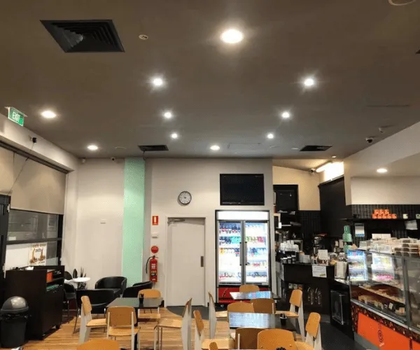
Colour zoning is also useful in offices, retail spaces and hospitality settings. A calm base colour can support a professional look, while targeted accents help direct attention to a reception desk, meeting area or product display. Commercial interiors need to work hard, so colour choices should account for lighting, traffic, cleaning requirements and the way the brand is meant to feel to customers.
Choose finish for the way the room is used
The colour is only half the decision. The sheen level affects how the surface looks, how it handles wear and how much light it reflects. Flat or matte finishes give walls a soft, modern appearance and help disguise minor surface variation. They are well suited to lower-traffic rooms, formal living areas and ceilings.
Low-sheen finishes are often the practical middle ground for living spaces, bedrooms and hallways. They provide a subtle finish with greater everyday durability. In kitchens, bathrooms, laundries and other areas exposed to moisture or frequent cleaning, a suitable washable paint system is a smarter choice than selecting solely by colour.
Doors, trims and skirting boards generally need a tougher finish because they receive more knocks, scuffs and regular cleaning. A professional painter can recommend a paint system that suits both the surface and the room, including plaster repairs or preparation where required. Good preparation is what allows the chosen colour and finish to look consistent across the job.
Test colour where it will actually be seen
Paint samples should be viewed on the wall, not judged only from a small swatch. Apply samples on different walls and check them in morning light, afternoon light and under artificial lighting at night. Melbourne weather can shift quickly, and rooms facing north, south, east and west will show the same colour differently.
Keep nearby fixed finishes in view while testing. Benchtops, tiles, carpet, flooring, cabinetry and curtains all influence how a paint colour reads. If you are keeping an existing sofa or timber table, bring it into the decision early. It is far easier to adjust a paint choice than to make a finished room work around a colour that fights with everything else.
Make a trend work for your property
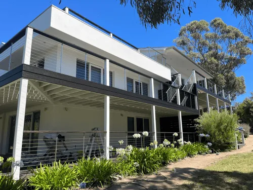
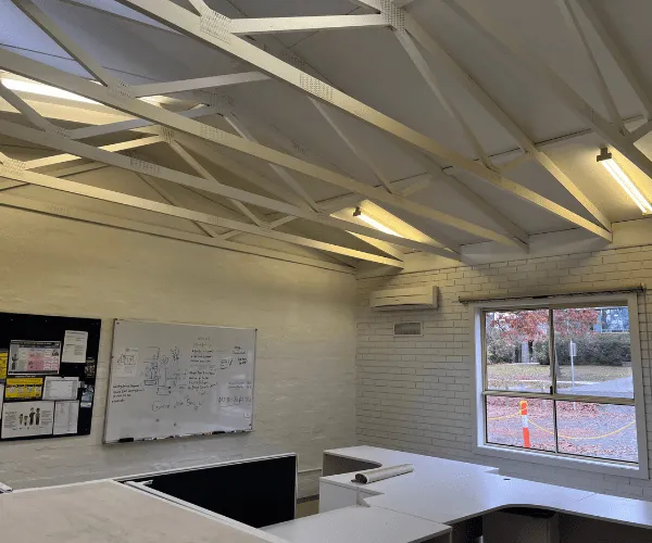
The most successful interiors do not chase every new colour. They use a current palette in a way that suits the building, the people using it and the level of maintenance it requires. A heritage weatherboard home may suit warmer whites, olive accents and soft tonal trims. A newer townhouse may look sharper with warm stone walls, crisp joinery and a deep charcoal study. A busy office may need quiet colours that support concentration and stand up to regular use.
If you are unsure where to begin, start with the room you use most. Choose a colour that improves how that room feels at the times you are actually there, then build the rest of the scheme around it. WE DO Painting can help Melbourne property owners turn a colour direction into a properly prepared, high-quality finish with minimal disruption.
A good colour choice should make you pause when you walk into the room, not because it is loud, but because everything finally feels like it belongs.