House Colour Trends 2026 for Melbourne Homes

House Colour Trends 2026 for Melbourne Homes

See the house colour trends 2026 bringing warmth, depth and lasting curb appeal to Melbourne homes, with practical advice for every room and exterior too.

A fresh coat of paint can change the way a home feels before you alter a single piece of furniture. The house colour trends 2026 are moving away from stark, short-lived looks and towards colours that feel warmer, calmer and easier to live with. For Melbourne homeowners, that means shades that work with changing light, established gardens, brickwork and the practical demands of a busy household.

The strongest trend is not one single colour. It is a more considered approach to building a palette that suits the property, its orientation and the people using it. A colour that looks excellent on a tiny sample can feel cold, heavy or overly bright once it covers an entire room or exterior wall. Good preparation, professional application and sound colour choices are what deliver a finish that keeps looking right over time.

House Colour Trends 2026: Warm, Grounded and Flexible

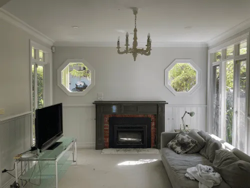
Cool grey had a long run, but 2026 is firmly leaning towards warmth. Think soft putty, mushroom, warm stone, sandy beige, gentle biscuit and muted clay. These neutrals provide a clean, modern foundation without making a home feel clinical.

Warm neutrals are particularly useful in open-plan homes, where one wall colour often needs to connect the kitchen, dining and living areas. They work well beside timber flooring, natural stone, brushed metal and off-white joinery. The result is relaxed and polished rather than overly styled.

That does not mean every room needs to be beige. The current direction is layered colour. A warm neutral on the main walls can sit alongside deeper trim, a coloured feature area or natural materials, creating contrast without visual clutter. It is a practical choice for homeowners who want a home that still feels current in several years.

Soft whites with depth

Bright white walls can make rooms feel sharp, especially in south-facing spaces or homes with plenty of grey light. Softer whites with cream, stone or faint grey undertones are becoming the better option for many interiors. They still reflect light and make a room feel spacious, but they bring more comfort to the finish.

The right white depends on what is already in the room. Benchtops, tiles, carpet, flooring and window furnishings all influence how a paint colour reads. A professional colour consultation before work begins can prevent the common problem of a white that suddenly looks yellow, blue or dull against fixed finishes.

Earth Colours Are Taking Centre Stage

Nature-inspired colours continue to shape interiors, but the 2026 version is refined rather than rustic. Olive and eucalyptus greens, softened terracotta, tobacco brown, dusty blue and muted burgundy are being used to add personality in a measured way.

Green remains one of the most adaptable choices. Pale sage can make a bedroom or bathroom feel settled, while deeper olive gives studies, dining rooms and cabinetry a more tailored look. In a home with garden views, green can also create a natural link between indoors and out.

Clay, cinnamon and terracotta shades bring warmth to living rooms, entries and dining spaces. The key is choosing toned-down versions rather than loud orange. These colours look particularly effective with oak, walnut, linen, black accents and warm white walls.

Deep blue is another dependable option, especially for a study, media room or front door. Navy and inky blue provide depth without the hardness of black. They can look formal in a period home and sharp in a newer build, depending on the surrounding colours and sheen level.

Colour Drenching for Rooms With Character

Colour drenching is one of the more noticeable house colour trends 2026 has brought into everyday homes. Instead of painting walls one colour and leaving all trim bright white, the walls, skirtings, doors and sometimes the ceiling are painted in related tones or the same shade.

Used well, this approach can make a small room feel intentional and enveloping. It suits powder rooms, bedrooms, studies and sitting rooms where atmosphere matters more than making the space appear as large as possible. A softened green, warm brown or smoky blue can give these rooms a strong sense of character.

There is a trade-off. Dark or mid-tone colour drenching can absorb light, so it is best suited to rooms with good lighting or spaces intended to feel cosy. In a narrow hallway or low-light room, a lighter tonal treatment may be the safer choice. Paint sheen also matters. Lower-sheen finishes help conceal minor surface variation, while a suitable durable finish is often needed for high-touch trim and doors.

Exterior Colours That Belong to the Street

Exterior colour is about more than kerb appeal. It protects the building surfaces and has to stand up to Melbourne weather, from hot summer exposure to wet, cold periods. The best exterior palettes balance personal taste with the architecture of the home and the surrounding streetscape.

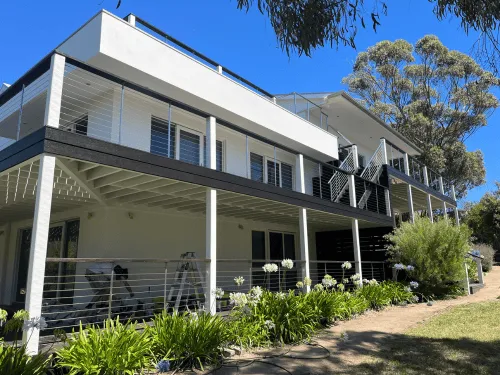
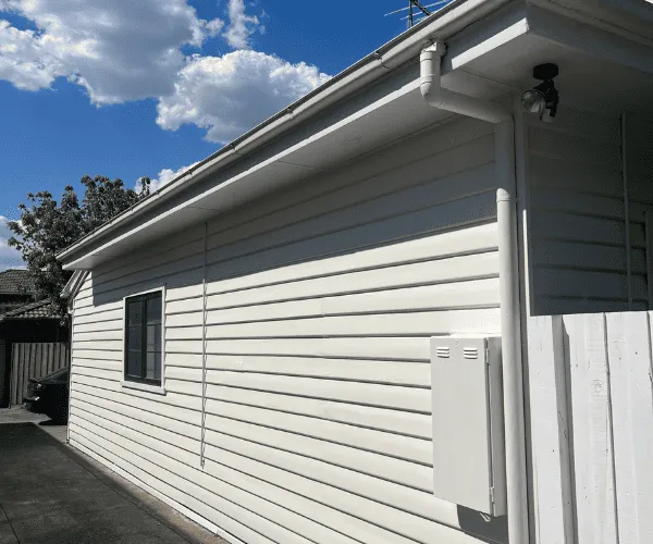
For 2026, exteriors are shifting towards softer, grounded combinations. Warm whites, light greige, weathered stone, muted olive, charcoal-brown and deep green are all strong choices. These shades generally sit more comfortably alongside brick, timber, concrete and landscaping than very bright whites or blue-toned greys.

A darker roof, gutters or window frames can be balanced with a warm, lighter wall colour. On the other hand, a lighter roof may suit deeper wall colours or a darker front door. Period homes often look best when their original details are acknowledged, while contemporary homes can carry cleaner blocks of colour and stronger contrast.

The front door earns its moment

The front door is one place where a bolder choice can be worthwhile. Deep forest green, dark navy, muted red-brown and blackened charcoal are all effective against warm neutral exteriors. A carefully chosen door colour creates a clear focal point without committing the whole house to a dramatic palette.

Before choosing, consider the amount of direct sun the door receives. Very dark colours can show dust and heat up quickly in exposed locations. The condition of the door, its material and the correct paint system should also be assessed before painting starts.

Do Not Ignore Undertones and Natural Light

Undertones are the reason two colours that appear similar on a paint card can look completely different on the wall. A beige may have a pink, yellow, green or grey base. A grey can read blue in one room and violet in another. The only reliable way to judge a colour is to test a good-sized sample in the actual space.

Look at samples in the morning, afternoon and evening, with lights on and off. Check them next to flooring, tiles, cabinetry and upholstery. For exteriors, view samples from the street as well as up close, because colours can look lighter and less intense across a larger surface.

Melbourne homes often have rooms with very different light conditions. A soft neutral that works beautifully in a sunny north-facing living room may feel flat in a darker rear bedroom. Selecting colours room by room, while keeping a consistent undertone through the home, gives better results than forcing one shade everywhere.

Practical Choices Make a Better Finish

Trends are useful for inspiration, but a paint scheme also needs to suit real life. Families may need durable finishes in hallways and around doors. Rental properties benefit from versatile colours that appeal to a broad range of tenants. Commercial spaces need colours that support a professional appearance while allowing maintenance work to be planned efficiently.

Preparation is equally important. Plaster repairs, timber repairs, cleaning, sanding and priming all affect how the final coat performs and looks. A quality colour can still disappoint if the surface beneath it has not been properly prepared.

For homeowners planning a full interior or exterior update, it is often more effective to choose a whole-house palette first. Start with the fixed elements you are keeping, settle the main wall colour, then select trims, feature colours and exterior accents. This avoids a collection of individually attractive colours that do not work together.

The best 2026 palette is one that makes your property feel well cared for, suits the way you live and holds up to daily use. If you are unsure where to start, an experienced painter can help assess the light, surfaces and existing finishes before the first brush is lifted. A thoughtful colour plan gives the work a clear direction and gives you a result you will be happy to come home to.