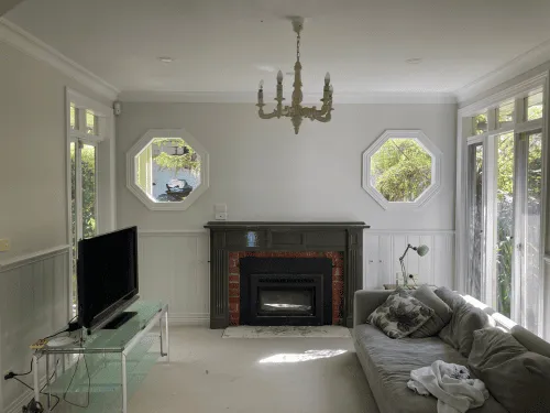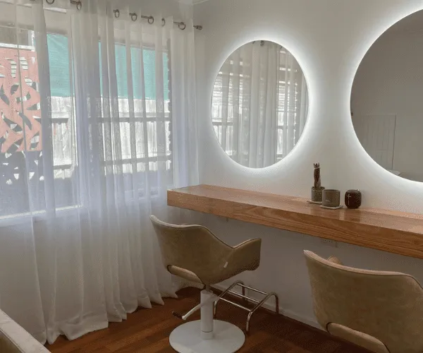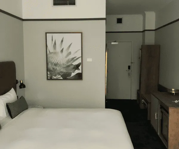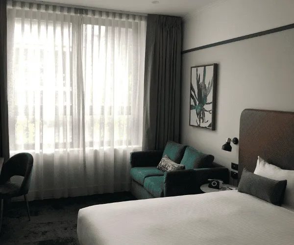
A paint chart can look simple enough until you hold ten different whites against your living room wall and all of them suddenly seem wrong. That is usually the point where choosing the best paint colours for interiors stops feeling exciting and starts feeling expensive. The good news is that most colour mistakes come down to a few practical issues – light, undertone, room use and finish – and once those are clear, the choice becomes much easier.
For most homes, the right interior colour is not the boldest option on the card. It is the one that suits the room, works with your flooring and furnishings, and still looks good in the morning, afternoon and at night. Good painting is about finish and workmanship, but it also starts with choosing colours that will keep working long after the job is done.
How to choose the best paint colours for interiors
The first thing to look at is natural light. A south-facing room can feel cooler and flatter, so colours with a little warmth often help it feel more comfortable. A bright north-facing room can handle cooler neutrals or stronger feature shades without feeling dull. If a room gets very little daylight, dark colours can look heavier than expected, while some stark whites can appear grey and lifeless.
Undertone matters just as much as the main colour. Two beige paints may seem nearly identical on a sample card, yet one can lean pink and the other yellow. The same issue comes up with greys, which may carry blue, green or brown undertones. That is why a colour that looked perfect in a display home can feel completely different in your own space.
Room size also plays a part, but not always in the way people expect. Light colours can help a room feel more open, but a well-chosen deeper tone can also make a large, empty room feel more balanced and finished. It depends on what you want the room to do. If the goal is softness and openness, stay light. If the goal is comfort, contrast or a stronger sense of character, a deeper shade may be the better choice.
Best paint colours for interiors by style and use
Warm whites remain one of the safest and most effective choices for interiors. They suit open-plan living, hallways, bedrooms and investment properties because they are flexible and easy to style around. A warm white helps soften modern finishes such as stone, black hardware and polished floors, and it generally feels more welcoming than a cold, bright white. The trade-off is that some warm whites can look creamy if the room gets strong sunlight, so testing them on site is essential.
Soft greige is another reliable option. Sitting between grey and beige, greige works well in homes where owners want a modern look without the sharpness that some cooler greys can bring. It pairs well with timber flooring, neutral furniture and black or brushed metal accents. In family homes, it also tends to hide day-to-day marks better than very crisp whites, which makes it practical as well as stylish.
Muted greens have become a strong choice for living rooms, bedrooms and studies. Sage, olive and dusty eucalyptus tones bring in colour without becoming too loud. They work especially well in Melbourne homes where people want an interior that feels calm and grounded rather than overly polished. Green also sits comfortably with natural materials like oak, linen and stone. The main caution is to watch the undertone. Some greens can shift muddy in low light, while others can look much brighter on a full wall than they do on a sample.
Earthy neutrals, including clay, mushroom and soft taupe, are a good fit for homes that need warmth and depth. These colours can make large spaces feel more settled and can give newer homes a more lived-in feel. They are especially useful when an owner wants a neutral backdrop but finds plain white too stark. The balance to strike here is saturation. Too much brown or red in the base can make the room feel dated, so the cleaner, softer versions usually work best.
Deep blue, charcoal and forest green can look excellent in the right room. These colours are better suited to spaces where atmosphere matters more than brightness, such as dining rooms, powder rooms, studies or feature walls in larger bedrooms. Used well, darker tones can make a room feel finished and confident. Used poorly, they can make it feel smaller and heavier than intended. Preparation and finish quality become even more important with these shades because imperfections are easier to notice.
The best interior paint colours for each room
Living areas usually benefit from flexible colours that work across changing light throughout the day. Warm whites, soft greiges and gentle greens are common favourites because they can handle a range of furniture styles and do not date quickly. In open-plan spaces, one consistent wall colour often gives the cleanest result, with contrast added through trim, joinery or furnishings rather than constant colour changes.
Bedrooms can handle a little more softness and mood. Muted green, dusty blue, warm beige and off-white all work well because they feel restful without looking flat. A bedroom does not need to be bright to feel fresh. In fact, slightly deeper, quieter tones often create a more comfortable space, especially in adult bedrooms.
Kitchens usually work best with colours that feel clean but not clinical. If cabinetry, splashbacks and benchtops already carry a lot of visual detail, the wall colour should support rather than compete. Warm white and light greige are dependable options here. If the kitchen is simple and modern, a subtle green-grey can add character without overwhelming the space.
Bathrooms are heavily affected by lighting, tile colour and gloss surfaces. A white with the wrong undertone can clash badly with cool tiles or chrome fittings. Soft neutral whites, pale greys and gentle stone-inspired shades usually perform well. It is less about following trends and more about making sure the wall colour sits comfortably with fixed finishes you are not planning to change.
Hallways and entry areas often get overlooked, yet they connect the whole home. A colour that is too dark can make these spaces feel narrow, while a harsh bright white can feel unfinished. A softer white or light neutral generally gives the best result and keeps movement between rooms feeling natural.
Finish matters as much as colour
Even the best colour can disappoint if the finish is wrong. Low-sheen finishes are popular for interior walls because they offer a clean look without drawing too much attention to surface variation. Matt can look excellent in the right room, but in busy areas it may not always be the most practical option. Washability, durability and the condition of the substrate all need to be considered.
Trim, doors and skirting usually suit a more durable enamel or semi-gloss finish, depending on the look you want. The contrast between wall and trim can be subtle or sharp, but it should be deliberate. If everything is the same tone and sheen, the room can look flat. If the contrast is too strong, it can feel busy. The best result usually comes from balance.
Common colour mistakes to avoid
One of the biggest mistakes is choosing from a tiny sample and committing too quickly. Paint always reads differently on a full wall. Another common issue is selecting a colour under showroom lighting and assuming it will behave the same way at home. It rarely does.
There is also a tendency to chase trends too hard. A colour that looks good online may not suit your flooring, your joinery or the amount of natural light in your home. Trend-led colours can still work well, but only if they suit the space itself. Practical choices usually age better than fashionable ones made in a rush.
Finally, do not judge colour in isolation. Walls are part of a bigger picture that includes flooring, benchtops, window furnishings, furniture and the amount of maintenance a room gets. The best interior colour is not just attractive on its own. It works with everything around it.
If you are unsure where to start, keep it simple. Choose a small group of colours that suit your light, test them properly, and think about how each room needs to feel and function. That approach nearly always leads to a better result than chasing the boldest sample on the shelf. A well-chosen interior colour should make the space feel right the moment you walk in – comfortable, considered and built to last.