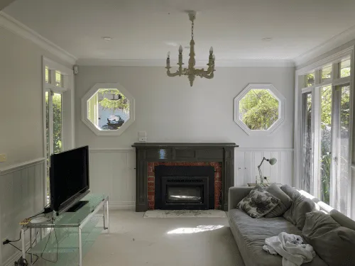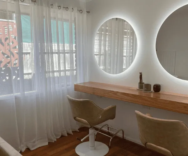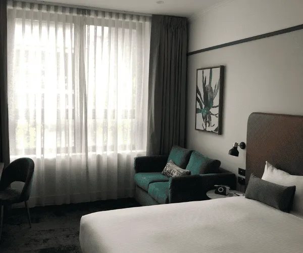
A small room does not need to be white to feel open. The best colours for small rooms are the ones that work with the natural light, layout and purpose of the space – not simply the palest shade on a paint chart. A well-chosen soft neutral can make a compact bedroom feel calm, while a deeper colour can give a small study, powder room or dining area real character.
The right paint colour changes how the edges of a room read. It can soften harsh corners, draw attention away from an awkward shape and make the space feel more settled. Just as importantly, the wrong undertone or finish can make a room feel flat, gloomy or more enclosed than it needs to be.
Start with the light, not the paint chart
Before selecting a colour, look at how the room receives daylight. This is particularly important in Melbourne homes, where the light can change noticeably through the day and from season to season.
North-facing rooms generally receive warmer, more consistent light. They can carry soft greys, muted greens and cooler whites well. South-facing rooms often have cooler light, so a warm white, gentle beige or creamy neutral can stop them feeling stark. East-facing rooms are bright early and quieter later in the day, while west-facing rooms become warmer and stronger in the afternoon.
Artificial lighting matters too. A warm globe can make a cool grey look slightly beige or violet at night. Cool lighting can make cream-based whites appear dull. Paint test patches on more than one wall and review them in morning, afternoon and evening light before committing. A sample board is useful because it can be moved around the room, away from the influence of the existing wall colour.
The best colours for small rooms by mood
There is no single best shade for every compact space. The practical choice depends on whether you want the room to feel brighter, quieter, more connected to adjoining areas or deliberately cosy.
Warm whites for a clean, open look
Warm white is a reliable choice for small bedrooms, hallways, laundries and living spaces with limited daylight. It reflects available light without the clinical feel that can come from a sharp blue-based white. Look for whites with a subtle cream, biscuit or soft grey warmth rather than an obvious yellow tone.
Using the same warm white on walls, trims and ceiling can reduce visual breaks. When the eye is not stopping at a strong contrast line, the room can feel less boxed in. This approach works especially well in units and townhouses with narrow hallways or lower ceilings.
Pure white is not always the answer. In a room with little natural light, it may look cold and shadowy rather than fresh. The surrounding flooring, tiles, cabinetry and window furnishings should guide the final undertone.
Soft greige and light taupe for everyday warmth
Greige – a balanced mix of grey and beige – is one of the most flexible options for a small room. It offers more depth than white but remains light enough to keep a space airy. A pale taupe can have a similar effect, particularly with timber floors, stone-look finishes and black or bronze hardware.
These colours suit spaces that need to work hard, such as a compact living room, spare bedroom or rental property interior. They are forgiving alongside different furniture styles and create a calm backdrop for artwork, rugs and timber accents.
The trade-off is undertone. Some greiges lean pink, green or purple once they are on a larger wall. Testing against fixed finishes is essential, particularly if you are keeping existing tiles or cabinetry.
Muted greens and blue-greys for calm depth
Soft sage, eucalyptus green and greyed blue can make a small room feel restful without making it feel closed in. Because these shades are muted rather than bright, they tend to sit back visually. They are a strong option for bedrooms, bathrooms and home offices where you want a more considered finish than a neutral alone can provide.
Keep the intensity low in a darker room. A pale, dusty sage is usually easier to live with than a saturated green. In a room with good light, a slightly deeper eucalyptus or blue-grey can add depth and make the space feel intentionally designed.
Pair these colours with warm white trims and natural materials to avoid a cold result. Timber, linen-look fabrics and warm lighting help balance cooler tones.
Blush, clay and soft peach for low-light rooms
Warm muted shades can be very effective in small rooms that do not receive much sun. Pale blush, soft clay, mushroom pink and subdued peach reflect warmth into the space and can be more flattering than a grey-based neutral.
The key is restraint. Choose a dusty or earthy version of these colours rather than a bright candy tone. A muted clay works beautifully in a compact sitting room or bedroom, while a very soft blush can add warmth to a small ensuite or dressing area.
These shades may not suit every commercial setting, but they can work well in a boutique reception area, salon treatment room or hospitality space where a welcoming atmosphere matters.
Should you use dark colours in a small room?
Yes, if you want the room to feel intimate, confident and purposeful. Dark colours do not physically make a room smaller. They make the boundaries less obvious, which can create depth, especially when used across walls, ceiling and trim in the same or closely related shade.
Deep navy, charcoal, forest green and rich brown can suit small studies, media rooms, powder rooms and dining spaces. They work best where the room has a clear purpose and you are not relying on it to feel light and airy.
A dark feature wall, on the other hand, can sometimes make a compact room feel shorter or narrower if it creates a hard visual stop. If you choose a feature wall, use it to highlight a natural focal point such as a bedhead wall, fireplace or built-in joinery. Avoid adding contrast simply because the room is small.
Use colour continuity to make rooms feel larger
One of the simplest ways to improve the feel of a small area is to limit abrupt colour changes. Painting a hallway and the rooms connected to it in closely related colours creates a more continuous view through the home. This does not mean every wall must be identical, but the tones should sit comfortably together.
For example, a warm white hallway can lead into a pale greige living room and a soft sage bedroom. The shift feels deliberate rather than chopped up. Consistency is especially useful in open-plan apartments, where several functions share a limited footprint.
Ceilings deserve attention as well. A ceiling painted in a white that relates to the wall colour can feel more integrated than a harsh, contrasting white. In a low room, a lighter ceiling usually helps lift the eye. In a small room with a high ceiling, taking the wall colour slightly onto the ceiling can make the proportions feel more balanced.
Choose the right paint finish
Colour is only part of the result. Paint finish affects how light moves across the walls and how well the surface stands up to daily use.
For most living areas and bedrooms, a low-sheen or washable matte finish provides a modern, soft look. It reduces glare, which is useful where light comes through a large window. In kitchens, bathrooms, laundries and high-traffic hallways, a durable washable finish is often the more practical choice because moisture, marks and regular cleaning need to be considered.
Trims and doors are usually finished in a higher sheen for durability and definition. If the room is very small, keeping trim colour close to the wall colour can create a quieter, more expansive effect. Strong white trim against a darker wall is a classic look, but it will make every edge more noticeable.
Common colour mistakes in compact spaces
The most common mistake is choosing a paint colour in isolation. A shade that looks right under store lighting may clash with your floors, benchtops or curtains once it is on the wall. Another is going too cool in a room that already lacks natural warmth.
Avoid relying on a tiny swatch. Colour becomes stronger across a full wall, and surrounding finishes influence how it appears. Test a few options side by side, then live with them for several days.
It is also worth considering the condition of the walls. Cracks, dents, uneven plaster and old repairs can become more visible under certain paint finishes or strong side lighting. Preparing surfaces properly is what gives a new colour the clean, professional result it deserves.
A small room can be bright, moody, warm or sophisticated. Choose a colour that suits the way you use the space, test it in its real lighting, and let quality preparation and application do the rest.