Walk into a newly fitted office, medical suite or retail space and the first thing people read is not the signage – it is the atmosphere. That is why commercial fitout colour trends matter. Colour shapes how a space feels, how professional it looks, and how confidently clients, staff and tenants respond to it from the moment they step inside.
For business owners and property managers, the right palette is not about chasing fashion for its own sake. It is about getting a fitout to work harder. Good colour selection can make a compact tenancy feel more open, a reception area feel more polished, or a staff space feel calmer and easier to use day to day. The best results come from balancing current style with practical use, lighting conditions and the long-term demands of a commercial site.
What is driving commercial fitout colour trends?
Recent commercial interiors have moved away from stark, cold schemes that can feel flat under artificial light. In their place, we are seeing colours that feel warmer, more grounded and more human. That shift reflects how workplaces and customer-facing spaces are being used now. Many businesses want interiors that support comfort and focus, while still looking sharp and professional.
There is also a stronger push for flexibility. A fitout often needs to appeal to staff, visitors, clients and future tenants at the same time. That is why many commercial fitout colour trends lean toward adaptable base tones, then use feature colours in controlled ways. It gives the space character without boxing the business into a look that dates too quickly.
In Melbourne, natural light also plays a major part. A colour that looks balanced in a sunlit showroom can feel very different in a deeper office suite or a corridor with limited daylight. Trend decisions need to be tested in the real space, not just picked from a chart under showroom lighting.
The leading commercial fitout colour trends right now
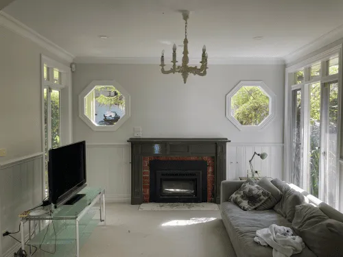
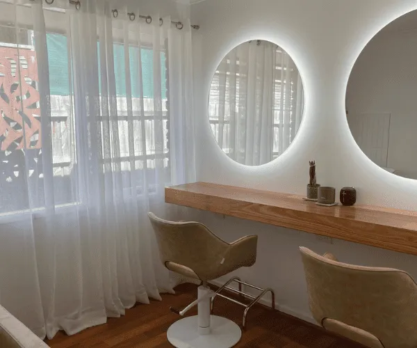
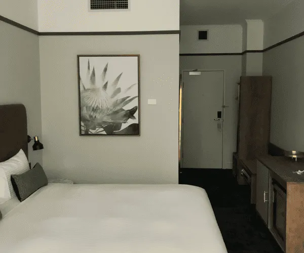
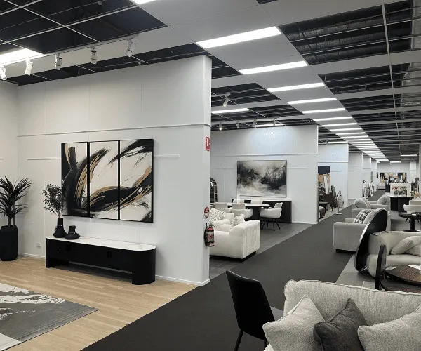
Warm neutrals are leading the way. Soft beige, greige, clay-based off-whites and muted taupes are replacing the cooler greys that dominated for years. These colours still feel professional, but they are easier on the eye and often more forgiving across large wall areas. They also work well with timber finishes, black hardware, stone surfaces and modern joinery.
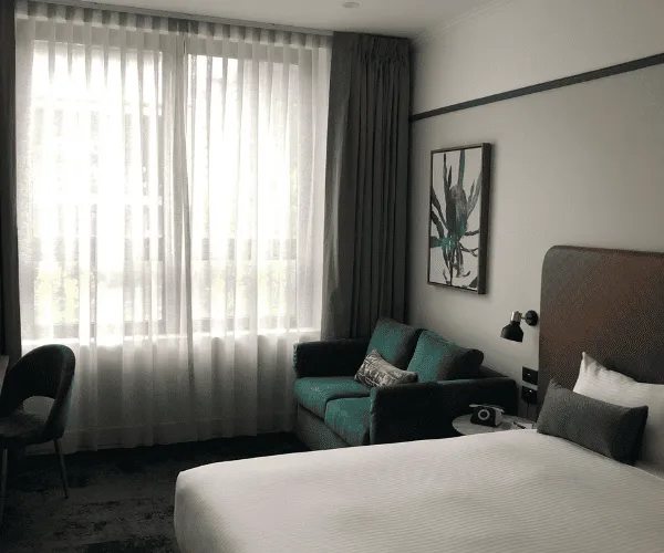
Green continues to hold its place, especially in muted and earthy shades. Sage, olive and softened eucalyptus tones are popular because they bring some depth without becoming overpowering. In offices, they can help create a more settled atmosphere. In health and wellness settings, they often feel calm and clean without looking clinical.
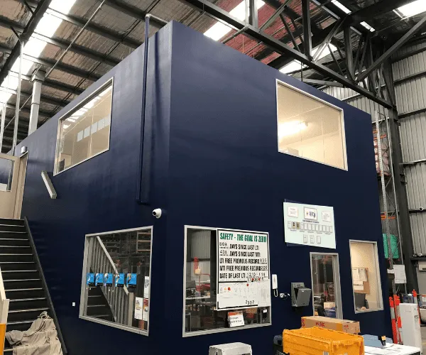
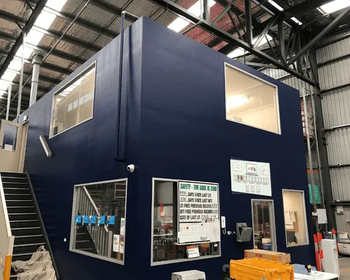
Blue is still widely used, though the direction has changed. Instead of bright corporate blue, there is more interest in dusty blue, deep navy and blue-grey. These shades suit boardrooms, waiting areas and feature walls where a business wants a more established, trustworthy feel.
Terracotta and muted rust accents are also showing up more often. Used carefully, these colours add warmth and individuality to retail, hospitality and creative workspaces. They are not right for every fitout, but in the right setting they can stop a space feeling too safe or generic.
Charcoal and black remain useful, though more as supporting colours than dominant wall colours. They are often used on trims, framing, doors, wayfinding features or selected architectural details. That approach keeps the fitout sharp without making it feel heavy.
Why warm neutrals are doing so much work
If there is one shift worth paying attention to, it is the move toward softer base colours. Warm neutrals are practical because they suit a wide range of industries. They create a clean backdrop, but they also add a bit more comfort than cool white or plain grey.
That matters in commercial spaces where people spend long hours. Staff areas, consulting rooms and shared office environments benefit from colours that feel settled rather than stark. For landlords and property managers, warm neutrals also make sense because they help broaden appeal. A tenancy with a balanced, modern palette is often easier to present than one built around strong, highly specific colours.
The trade-off is that not all warm neutrals behave the same way. Some can turn too yellow, too pink or too brown depending on lighting and surrounding finishes. The safer approach is to assess samples against flooring, joinery, glazing and existing fixtures before locking anything in.
Using bolder colours without overdoing it
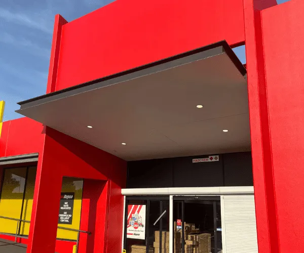
Not every commercial fitout should play it safe. Some businesses need colour to support brand presence, customer experience or internal culture. The key is to use stronger colours with purpose.
A bold accent can work well behind a reception desk, in a meeting room, within a breakout space or on selected joinery elements. It can help define zones in an open-plan layout and add visual interest without dominating the whole site. This is especially useful in larger fitouts where one flat colour can make the space feel too repetitive.
The problem comes when bold shades are spread too widely. A colour that looks impressive on a sample card can become tiring when used wall to wall. In commercial work, restraint usually gives a better result. A strong feature paired with a reliable neutral base tends to age better and is easier to maintain as branding or tenancy needs change.
Commercial fitout colour trends by space type
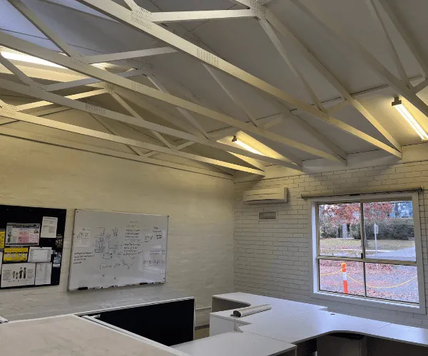
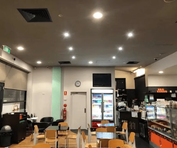
Different environments call for different approaches. An office fitout usually benefits from colours that support concentration, comfort and a sense of professionalism. Soft neutrals, layered greys, muted greens and controlled darker accents are common because they help create a polished but workable environment.
Retail spaces often have more room to be expressive. The palette might reflect brand identity more directly, especially in boutiques, showrooms and hospitality venues. Even then, the strongest fitouts still think about customer flow, lighting and how stock or displays will sit against the wall colour.
Medical and consulting suites generally suit quieter palettes. Warm whites, soft greens and pale blue-grey tones can help the space feel clean and reassuring. A hard, overly bright white scheme can sometimes feel too sterile, while darker dramatic tones may not suit every patient-facing setting.
Industrial and warehouse-adjacent fitouts are usually more functional, but that does not mean colour should be ignored. Front-of-house areas, offices and staff amenities still benefit from thoughtful colour choices that improve presentation and day-to-day use. Durable finishes and practical maintenance matter just as much as appearance in these settings.
How to choose colours that will last
Trends are useful, but a commercial fitout needs to hold up well beyond this year. The best approach is to start with the purpose of the space. Ask what the environment needs to communicate. Professionalism, warmth, energy, calm, premium service and reliability all suggest slightly different colour directions.
After that, consider the fixed elements. Flooring, ceilings, benchtops, cabinetry, signage and natural light will all influence how paint colours read. It is much easier to build a cohesive result when the paint palette works with those existing materials rather than fighting them.
Maintenance should also be part of the decision. In high-traffic commercial spaces, very light walls can mark easily and very dark colours can highlight dust or surface wear. Mid-tone and balanced neutral colours often give the best mix of presentation and practicality.
This is where experienced advice can save time and cost. A colour that looks good in theory still needs to suit the site, the finish schedule and the way the property is used. For many Melbourne businesses, the smartest fitout choices are the ones that look current now but still make sense in three to five years.
The finish matters as much as the colour
Commercial fitout colour trends are not only about hue. The finish can change the whole effect. A low-sheen wall finish often gives a more refined, modern look and can soften the appearance of strong lighting. In other areas, a more washable finish may be the better choice because performance matters more than the subtlety of the look.
Consistency is important too. Even a well-chosen palette can fall short if the application is patchy or the cut lines are rough. In commercial settings, clients notice neat finishes, clean edges and an even result across large surfaces. Good workmanship is what turns a colour scheme from a nice idea into a professional fitout.
Colour trends will keep shifting, but the strongest commercial interiors usually follow the same principle. Choose colours that suit the business, support the way the space is used and still look right when the fitout settles into everyday use. That is what gives a commercial space staying power.