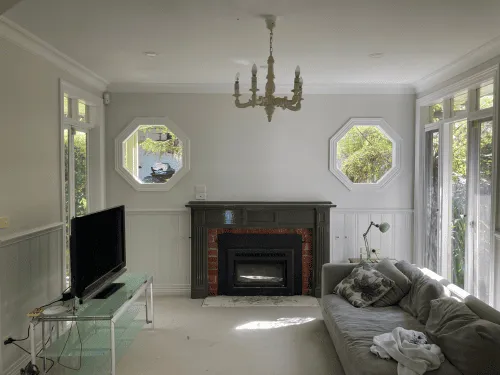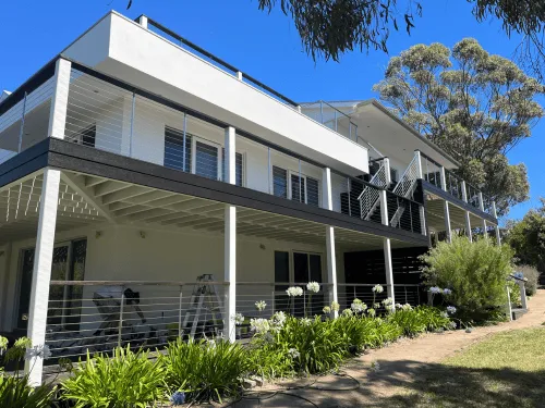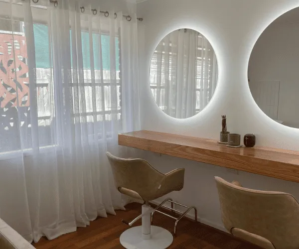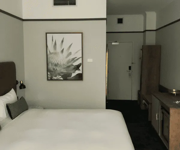
If you are planning to repaint this year, interior house paint colours 2026 are heading in a clear direction – warmer, softer and easier to live with. After years of stark whites and cool greys, many homeowners are choosing colours that feel settled, comfortable and a bit more personal. The shift is not about chasing fashion for its own sake. It is about creating rooms that look current without feeling dated in 12 months.
That matters if you are painting a family home, preparing a property for sale, or updating an investment. Paint is one of the fastest ways to change how a space feels, but it also affects light, maintenance and resale appeal. The best results come from choosing colours that suit the room, the natural light and the way the property is actually used.
What interior house paint colours 2026 are doing differently
The strongest trend for 2026 is warmth with restraint. People still want clean, fresh interiors, but not the cold, flat look that came with blue-based whites and steely greys. Instead, the move is towards quiet neutrals, earthy mid-tones and muted colours that add depth without becoming hard work.
That means creamy whites are replacing clinical whites. Greige is staying around, but the better versions lean warmer and more natural. Soft clay, dusty green, muted blue-grey and gentle mushroom tones are all getting attention because they give a room shape without overpowering it.
There is also a practical reason these colours are performing well. They tend to handle changing light better across the day. In many Australian homes, especially those with strong sun in one part of the house and shade in another, cool colours can swing from crisp to lifeless very quickly. Warmer tones generally stay more balanced.
The colours likely to lead in 2026
Warm whites that still feel fresh
Warm whites are set to stay at the top of the list. Not yellow, not cream in an old-fashioned sense, but whites with a soft undertone that make walls feel brighter and more inviting. They work especially well in living areas, hallways and open-plan spaces where you want continuity.
The appeal is simple. Warm white gives you flexibility with flooring, timber, stone and soft furnishings. It also makes maintenance touch-ups easier than trying to match a sharper, cooler white that can show variation more obviously.
The trade-off is that not every warm white suits every home. In rooms with very little natural light, some can read dull if the undertone is too heavy. Testing on more than one wall is worth the effort.
Earthy neutrals with more depth
Beige is back, but in a cleaner and more refined way. Think oat, sand, mushroom and soft taupe rather than the heavier beige tones people are trying to leave behind. These colours work because they add warmth without dominating the room.
They are particularly useful in homes where pure white walls feel too stark against timber floors, cream tiles or older joinery. They also create a more connected look in houses where not every surface is brand new. For many properties, that balance is more realistic than trying to force a magazine-white finish into every room.
Greens that feel calm, not trendy
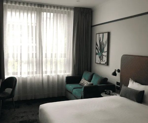
Muted green continues to gain ground, especially in bedrooms, studies and living rooms. The better 2026 greens are soft olive, sage and grey-green rather than bright botanical shades. These colours bring a calm, settled feeling and pair well with timber, black accents and natural textiles.
Green can be a smart choice if you want some personality without going too bold. It has enough colour to feel intentional, but when toned down properly it still behaves like a neutral. That said, green is very sensitive to light. In south-facing rooms or darker corners, it can look flatter or muddier than expected.
Dusty blues and blue-greys
Blue is not disappearing, but it is becoming quieter. The navy feature wall has had a long run, and many homeowners now want something softer. Dusty blue, stormy blue-grey and muted slate are more in line with where interiors are heading.
These shades can work beautifully in bedrooms, bathrooms and formal living areas. They bring a clean, settled look, especially when paired with white trim and warm lighting. The caution is that blue can still feel cool if overused, so it usually works best when balanced with warmer flooring, furniture or cabinetry.
Clay, terracotta and muted pink-based neutrals
One of the more interesting directions in interior house paint colours 2026 is the rise of subtle clay and pink-based neutrals. Not peach, not anything sugary – just grounded colours with a hint of warmth. In the right setting, they make a room feel comfortable and considered.
These tones are not for every whole-house scheme, but they can work extremely well in powder rooms, bedrooms and quiet sitting spaces. They suit homes that already feature natural stone, warm timbers and textured finishes. Used carefully, they feel current. Used too heavily, they can date a room quickly. This is where restraint matters.
What is fading out
The biggest decline is in cold grey interiors. Grey is not gone altogether, but the flatter, blue-based greys that dominated for years are losing favour. They can make spaces feel harder, especially when paired with cool lighting and minimal furnishing.
Harsh bright white is also becoming less popular in lived-in homes. It still has its place in some modern builds and trim work, but across full interiors it can feel too clinical unless every other element is carefully balanced.
Overdone feature walls are easing off as well. People still use contrast, but more often through joinery, a study nook, a bedroom wall in a softer tone, or colour carried consistently through a whole zone. The result feels more deliberate and less tied to a particular era.
How to choose the right 2026 colours for your home
Following a trend only gets you so far. The better question is whether the colour works in your property, with your light and your finishes.
Start with fixed elements. Flooring, benchtops, tiles, splashbacks and cabinetry all affect how paint reads. A warm neutral that looks perfect in a showroom can clash badly with cooler stone or tile once it is on your walls. If those fixed surfaces are staying, they should guide the paint selection.
Light matters just as much. Natural light changes colour more than most people expect. A tone that feels soft and airy in a bright front room may feel heavy in a shaded hallway. Test colours at different times of day, and test them in the actual room, not just from a sample card.
Room function also matters. Open-plan living areas usually benefit from colours that are easy to carry across large spaces without becoming tiring. Bedrooms can handle a little more depth and mood. Hallways, stairwells and rental properties often do best with dependable neutrals that age well and are easy to maintain.
Practical advice before you commit
Paint colour is only part of the result. Surface condition, preparation and finish level all affect how the final job looks. The same colour can feel smooth and premium on a properly prepared wall, or patchy and underwhelming on a surface with poor prep.
Finish selection is part of that decision. Low-sheen finishes are popular for walls because they soften the look and help hide minor imperfections, while semi-gloss or gloss is often better suited to trim and doors that need durability. In busy households, washable finishes are worth considering, especially in corridors, kitchens and kids’ rooms.
It is also worth thinking beyond one room. Some colours look great in isolation but make the whole house feel disconnected when every space changes sharply from one to the next. A simple, consistent palette usually gives a better long-term result than trying to make every room stand out on its own.
For homeowners who want a safe choice, warm whites and soft greiges remain the easiest path. For those wanting more character, muted green or dusty blue can work well when used in the right rooms. The key is not picking the most talked-about shade. It is picking the one that still feels right when the furniture is back in place and daily life returns to normal.
A fresh coat of paint should make your home feel better to live in, not just newer to look at. If a colour gives you that balance – practical, current and easy to live with – you are probably on the right track.